What is non-parametric regression?
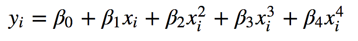
Stata version 15 now includes a command npregress, which fits a smooth function to predict your dependent variable (endogenous variable, or outcome) using your independent variables (exogenous variables or predictors). The function doesn’t follow any given parametric form, like being polynomial:
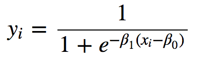
or logistic:
Rather, it follows the data. You can get predicted values, and residuals from it like any other regression model.
Stata achieves this by an algorithm called local-linear kernel regression. A good reference to this for the mathematically-minded is Hastie, Tibshirani and Friedman’s book Elements of Statistical Learning (section 6.1.1), which you can download for free. Linear regressions are fittied to each observation in the data and their neighbouring observations, weighted by some smooth kernel distribution. The further away from the observation in question, the less weight the data contribute to that regression. This makes the resulting function smooth when all these little linear components are added together.
You might be thinking that this sounds a lot like LOWESS, which has long been available in Stata as part of twoway graphics. It is, but with one important difference: local-linear kernel regression also provides inferential statistics, so you not only get a predictive function but also standard errors and confidence intervals around that. That means that, once you run npregress, you can call on the wonderful margins and marginsplot to help you understand the shape of the function and communicate it to others.
npregress works just as well with binary, count or continuous data; because it is not parametric, it doesn’t assume any particular likelihood function for the dependent variable conditional on the prediction.
An example with heart disease data
To work through the basic functionality, let’s read in the data used in Hastie and colleagues’ book, which you can download here. It comes from a study of risk factors for heart disease (CORIS study, Rousseauw et al South Aftrican Medical Journal (1983); 64: 430-36.), comprising nine risk factors and a binary dependent variable indicating whether the person had previously had a heart attack at the time of entering the study.
We’ll look at just one predictor to keep things simple: systolic blood pressure (sbp).
npregress kernel chd sbp
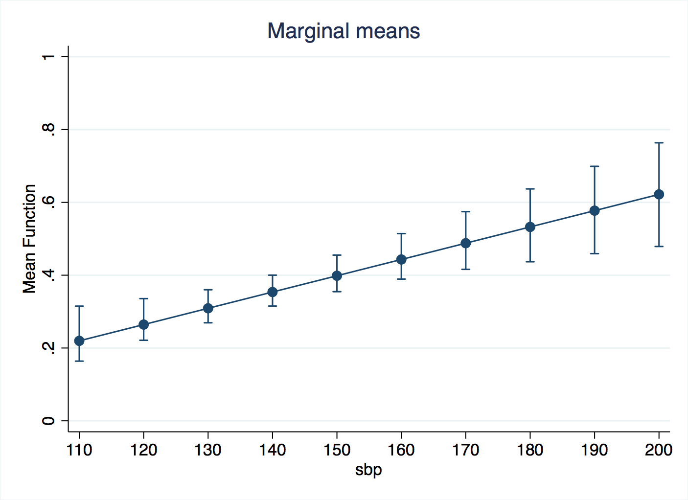
That’s all you need to type, and this will give an averaged effect (slope) estimate, but remember that the whole point of this method is that you don’t believe there is a common slope all the way along the values of the independent variable. npregress saves the predicted values as a new variable, and you can plot this against sbp to get an idea of the shape.
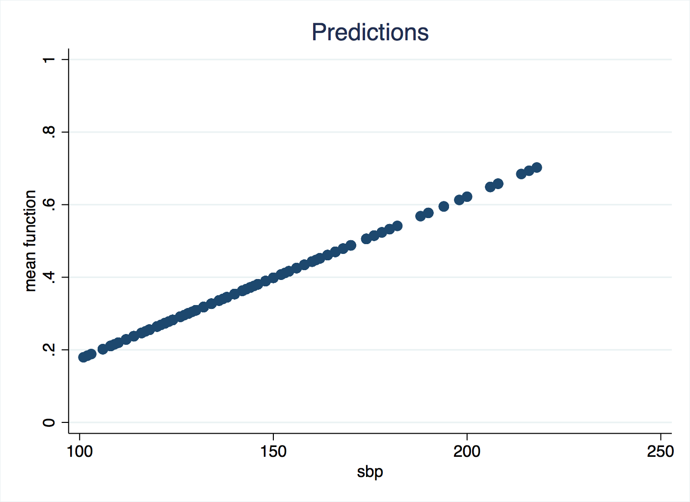
Are you puzzled by this? So much for non-parametric regression, it has returned a straight line! The flexibility of non-parametrics comes at a certain cost: you have to check and take responsibilty for a different sort of parameter, controlling how the algorithm works. Recall that we are weighting neighbouring data across a certain kernel shape. The wider that shape is, the smoother the curve of predicted values will be because each prediction is calculated from much the same data. If we reduce the bandwidth of the kernel, we get a more sensitive shape following the data. If we don’t specify a bandwidth, then Stata will try to find an optimal one, and the criterion is uses is minimising the mean square error. Mean square error is also called the residual variance, and when you are dealing with binary data like these, raw residuals (observed value, zero or one, minus predicted value) are not meaningful. And this has tripped us up. We can look up what bandwidth Stata was using:
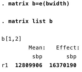
Despite sbp ranging from 100 to 200, the bandwidth is in the tens of millions! Essentially, every observation is being predicted with the same data, so it has turned into a basic linear regression. This is because the residual variance has not helped it to find the best bandwidth, so we will do it ourselves.
This is the sort of additional checking and fine-tuning we need to undertake with these kind of analyses. Hastie and colleagues summarise it well:
The smoothing parameter (lambda), which determines the width of the local neighbourhood, has to be determined. Large lambda implies lower variance (averages over more observations) but higher bias (we essentially assume the true function is constant within the window).
You will usually also want to run margins and marginsplot.
To get inferences on the regression, Stata uses the bootstrap. You can either do this in the npregress command: npregress kernel chd sbp, reps(200) or in margins: margins, at(sbp=(110(10)200)) reps(200). Either way, after waiting for the bootstrap replicates to run, we can run marginsplot.
Fine-tuning the bandwidth
We can set a bandwidth for calculating the predicted mean, a different bandwidth for the standard erors, and another still for the derivatives (slopes). A simple way to gte started is with the bwidth() option, like this:
npregress kernel chd sbp , bwidth(10 10, copy)
That will apply a bandwidth of 10 for the mean and 10 for the standard errors. In this do-file, I loop over bandwidths of 5, 10 and 20, make graphs of the predicted values, the margins, and put them together into one combined graph for comparison. A simple classification table is generated too. Here’s the results:
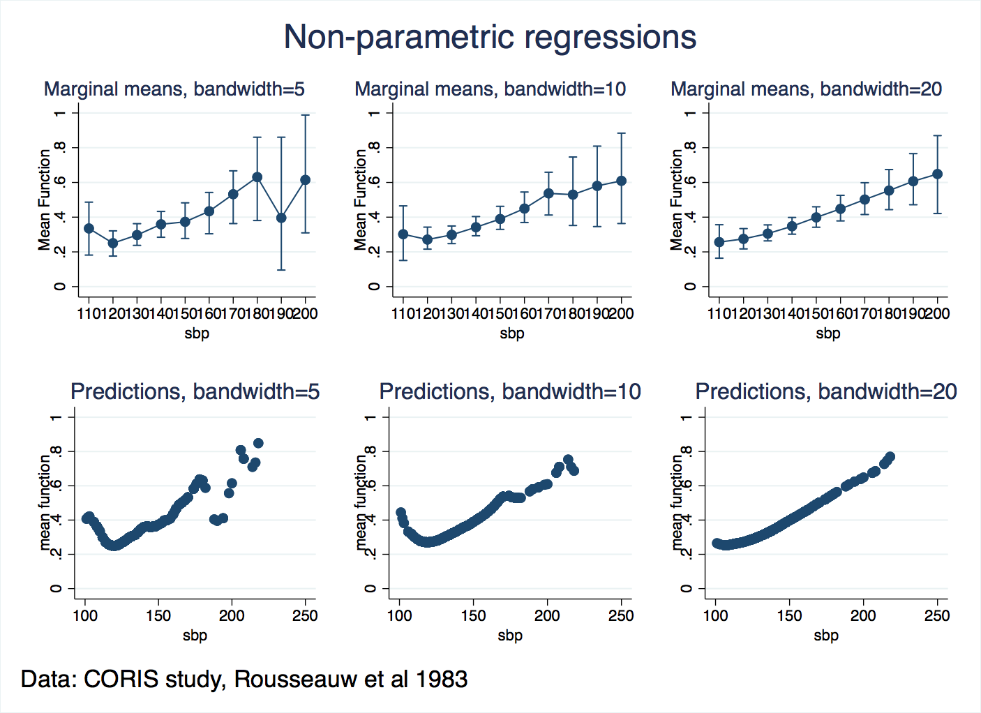

So, it looks like a bandwidth of 5 is too small, and noise (“variance”, as Hastie and colleagues put it) interferes with the predictions and the margins. Bandwidths of 10 and 20 are similar in this respect, and we know that extending them further will flatten out the shape more. So, we can conclude that the risk of heart attacks increases for blood pressures that are too low or too high. That may not be a great breakthrough for medical science, but it confirms that the regression is making sense of the patterns in the data and presenting them in a way that we can easily comunicate to others.
What else could we do?
The classification tables are splitting predicted values at 50% risk of CHD, and to get a full picture of the situation, we should write more loops to evaluate them at a range of thresholds, and assemble ROC curves. But we’ll leave that as a general issue not specific to npregress.
There are plenty more options for you to tweak in npregress, for example the shape of the kernel.